
About the project
A purpose-led brand that promotes artisanal craftsmanship, the site features a collection of sustainably sourced, ethically made pieces ranging from home décor to fashion accessories.
My Role
Product Designer (team of 4)
Timeline
6 weeks
Tools Used
Hi-Fidelity Screens
Prototype
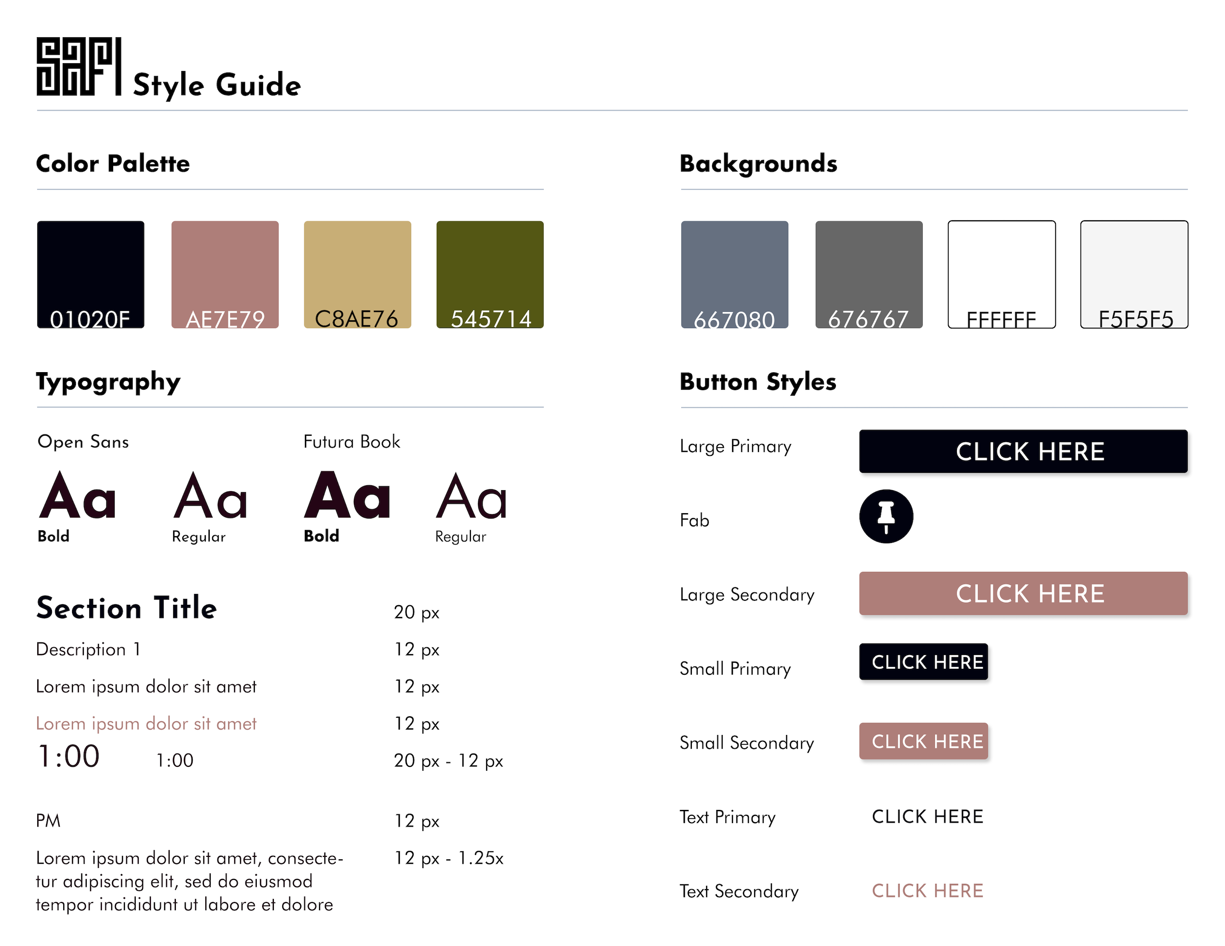
Branding
Case Study
Designing Process
We follow IDEO’s Human-Centered Design and Lean UX Design Thinking process to make sure that my design decisions were supported by user research and feedback.
Empathize
Define
Ideate
Prototype
Validate
User Research
The first thing we focused on was our research strategy. In order to identify the flaws in the current UX and UI, we conducted a usability test by interviewing people that fit our user archetype. These were owners of small businesses, who are looking for suppliers, preferably from Africa. Before we began our interviews we first needed to do two things.
- First we conduct a competitor analysis. Aside from using and understanding SAFI Label, this also gave us an insight in the market space and provided additional context for the problem we are working on.
- Secondly we create an interview guide in preparation for Usability Testing. This enabled us to conduct our interviews in a consistent and controlled manner.
Competitive Analysis
As part of our Competitor Analysis, we conducted an analysis on four websites with similar product offerings to SAFI Label. These were: Urban Zen, Goodee, Powered by People, and Novica.
We focused our research on the Site Map, User Interface elements, and User Experience Flows, including the sign–up, Check–out, Browsing, and Features processes.
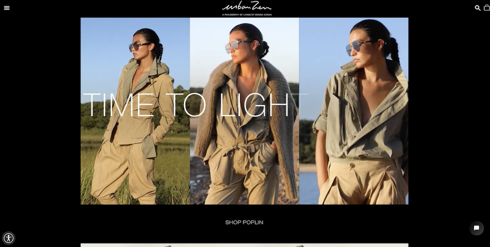
Urban Zen
- Strengths
- Easy product discovery w/ links to each category
- Prominent CTA for “Add To Shopping Bag”
- Secondary navigation guides users to content nearby
- Weaknesses
- The mention of artisans buried within the “initiatives” link is not easy to find. Information is top-level, with no detail about individual makers.
- Action Items
- Create a “Meet The Makers” section to help buyers learn more about each artisan’s design process, where they find inspiration and learn more about the positive economic & social impact each artisan has on their local region.
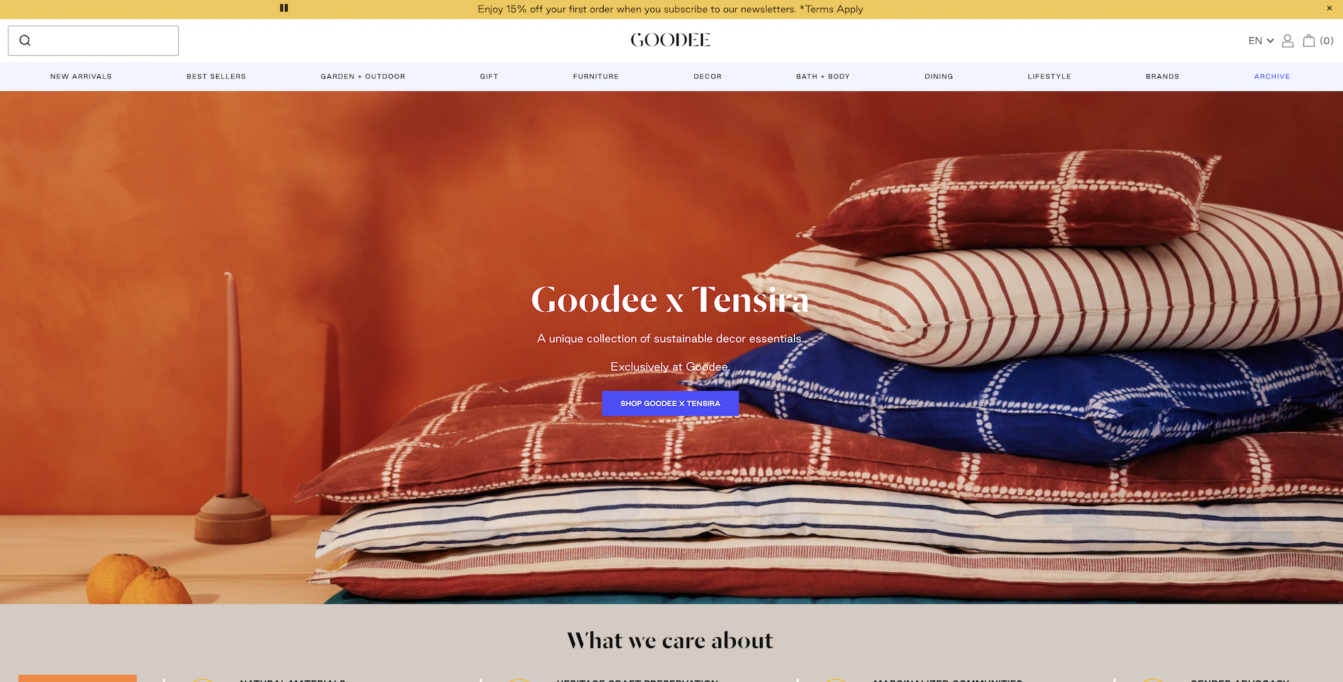
Goodee
- Strengths
- Call to action button is clearly visible
- Search results display items with pricing, details
- Organized gallery layout with product images
- Weaknesses
- On the landing page, very hard to read the paragraph text with the images as background
- The decorative font is hard to read at times when there’s a busy background
- Font varies from regular to bold. Needs to be consistent
- Action Items
- Include an option to order large quantities of a product
- Clear, stand out a call to action buttons
- Incorporate hover action over product image (when
gallery layout) to quickly add to cart
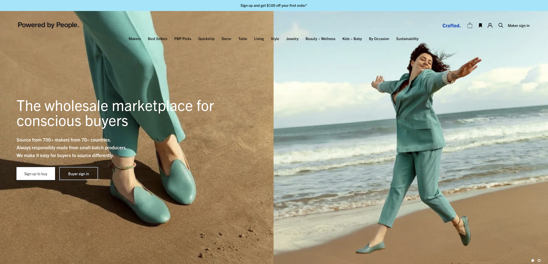
Powered by People
- Strengths
- Simple and intuitive UI design
- Buyers profile has all the information, including the company profile, payment methods, and the tax ID
- CTA prompts users to sign in/sign up to see the wholesale price of the product they are currently viewing
- Weaknesses
- The user’s website is mandatory
- The navigation menu doesn’t indicate the current page
- No clear affordance or signifiers of how to finalize the purchase
- Action Items
- Make artisans’ profiles front and center
- CTA for signing up
- Simplify potential buyers’ signing up process
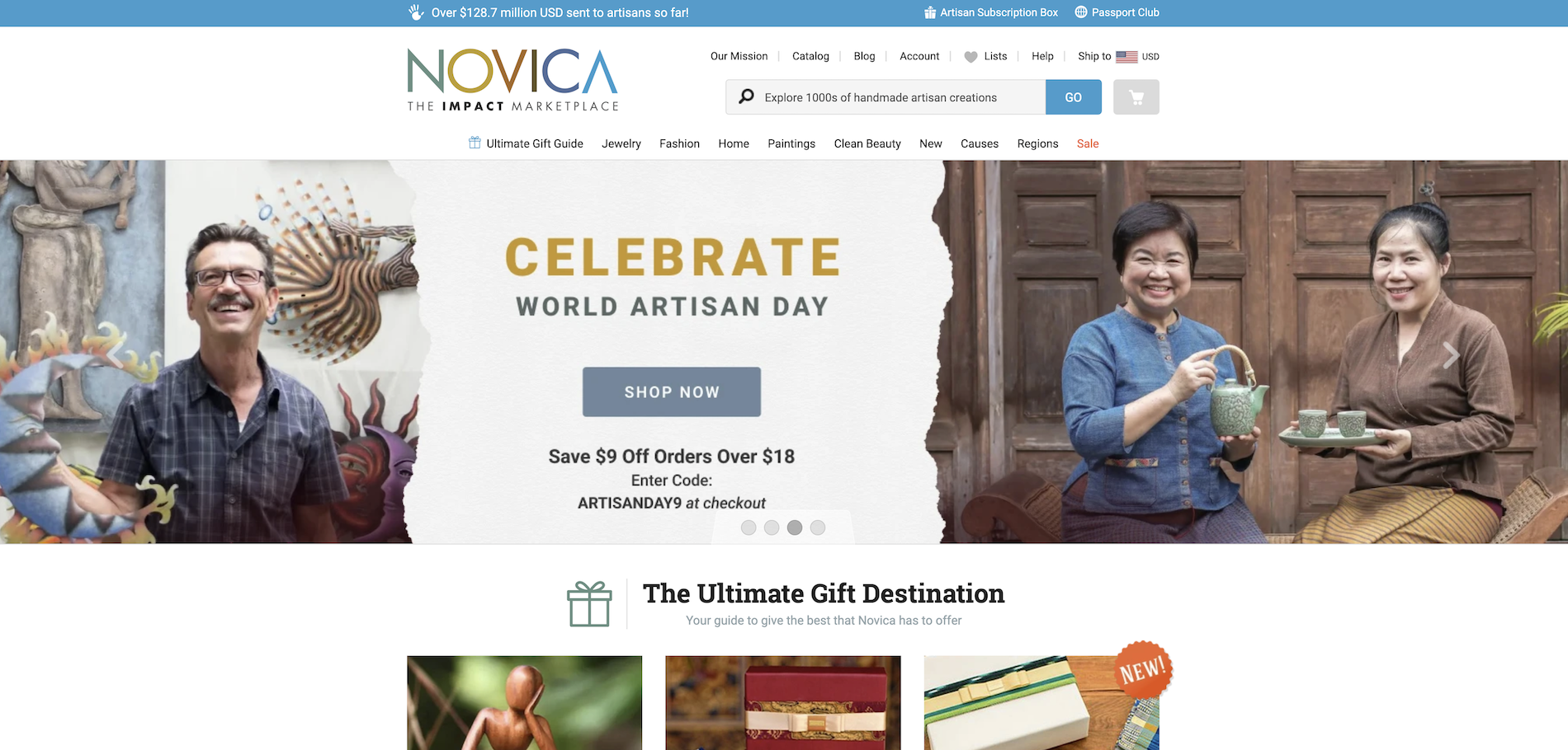
Novica
- Strengths
- Organize products based on regions and artisans
- Artisan’s description is in story format
- The order is trackable.
- Weaknesses
- Site structure is based on the type of product.
- Doesn’t have information about artisans’ specialties.
- Doesn’t have consistent look throughout the site.
- Action Items
- Tag each product with its region and artists for filtering and searching purposes.
- Add an option to customize orders for wholesalers.
- Have consistent look throughout the site. Stick to branding guidelines.
Empathy Map
To start off, I created a provisional persona of potential SAFI users based on a selection of current SAFI users and my understanding of people I knew that used wholesale websites.
Job
Owner of small business
Industry
Fashion, art, and craft
Goals
To find suppliers of raw materials for their art and craft
Preferrences
Being able to monitor order online
Says
- “It’s difficult to find brands that I trust”
- “I want to connect with skilled artisans”
- “Purchasing from brands who share my social and ethical values is important”
Does
- Clicks on the search bar and types a keyword for the product they’re seeking.
- Clicks on a topic in navigation and takes the user to the general product page.
- Clicks on a product and is taken to a product details page.
- Selects quantity of product and adds product to shopping cart.
- Proceeds through proper registration and checkout process.
Thinks
- The user thinks the supply chain system is unclear. In order to gather information, the user needs to do intensive research.
- The user thinks Africa has beautiful products compared to others.
- The user thinks Africa’s middlemen are not as reliable as others.
- The user thinks the current manual administrative process involved in outsourcing and managing orders is outdated.
Feels
- Hard to find the right suppliers in Africa
- Frustrated when suppliers delay production
- Obsessed with crafts of artisans in Africa
- Excited about finding affordable distribution partners
User Personas
After feedback from user interviews and competitive usability testing, I created three lightweight user personas for SAFI Label based on their different shopping behaviors:
- Anna, a Conservative Shop Owner, has a value-based budget.
- Tim, an Explorer Shop Owner, has a love for exotic and unique products.
- Hadiza, a Home Supporting Shop Owner, has a strong urge to support her hometown.

Conservative Shop Owner
Want to find a new source of artisanal products. Origin of the products are not as important as the quality and value.
Goals
- Keep the supply at a value-based budget.
- Find artisans that can support her creative mind at a reasonable price.

Explorer Shop Owner
Want to find supply sources that provide unique materials. Willing to pay a premium price for premium quality.
Goals
- Find unique materials
- Find artisans that can support his creative mind.

Home Supporting Shop Owner
Want to find artisans from her origin. Willing to pay more to support her hometown and promote her traditional designs.
Goals
- Promoting design and material that are from her hometown.
- Find artisans to support a cause at her hometown.
How Might We
After doing guerilla usability testing with our candidates, we reviewed the recordings and used affinity mapping to group the pain points into similar categories, which came down to the below HMW question:
How might we design a seamless purchasing experience for wholesale buyers?
Key Features
Most wanted features people wish existed
- Able to review artisans’ portfolios before placing an order
- Collaborate with artisans to create fully customized items
- Have history, sourcing information, and quality of the material ready
- Track order process
- Discount code
Features will be included in the MVP
- Able to review artisans’ portfolios before placing an order
- Collaborate with artisans to create fully customized items
- Track order process
Sitemap
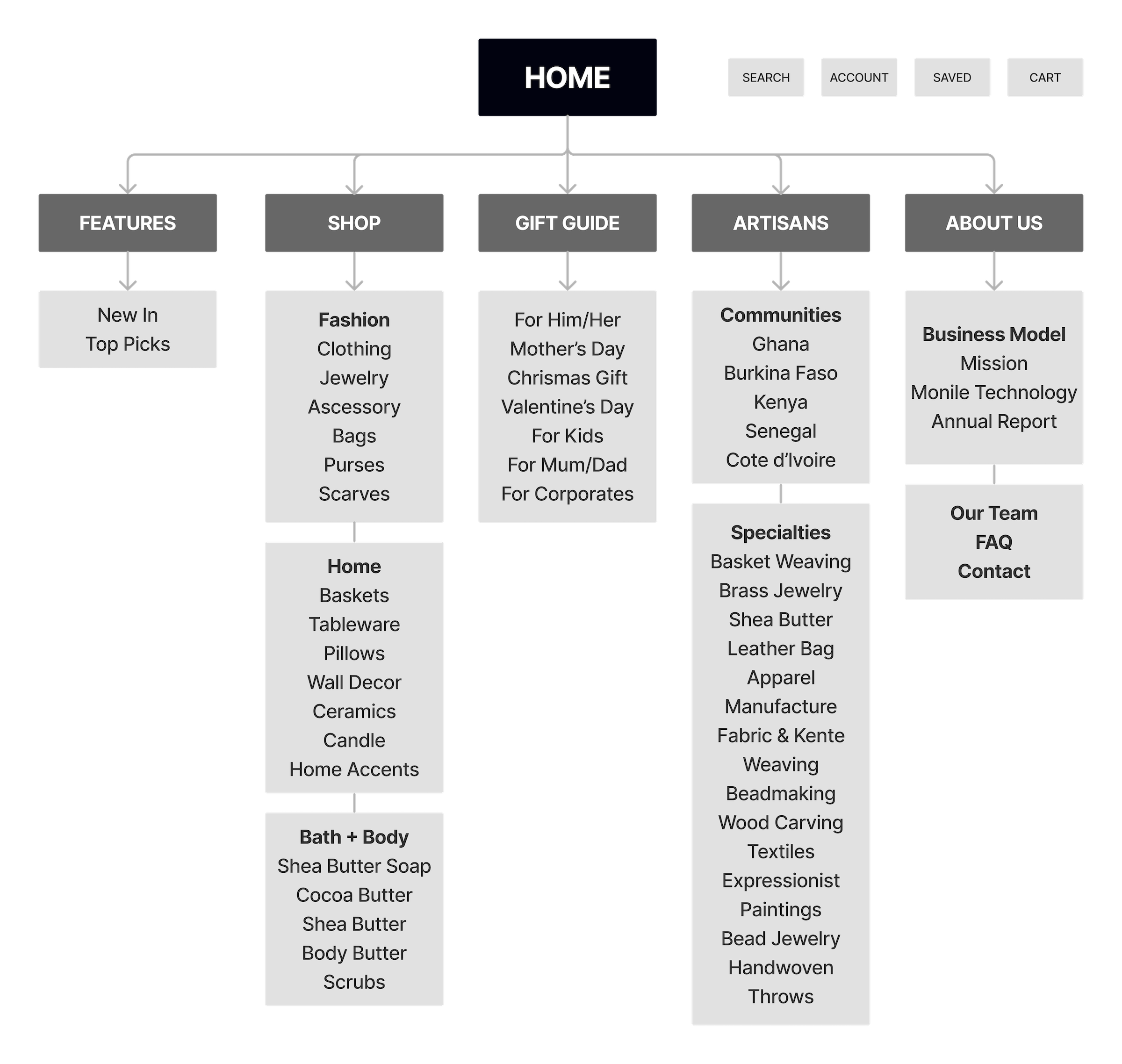
I first created a sitemap to structure the MVP content. Besides having a list of products, and information about the company, I added featured products, gift guides, and artisans’ information to the menu.
User Flows
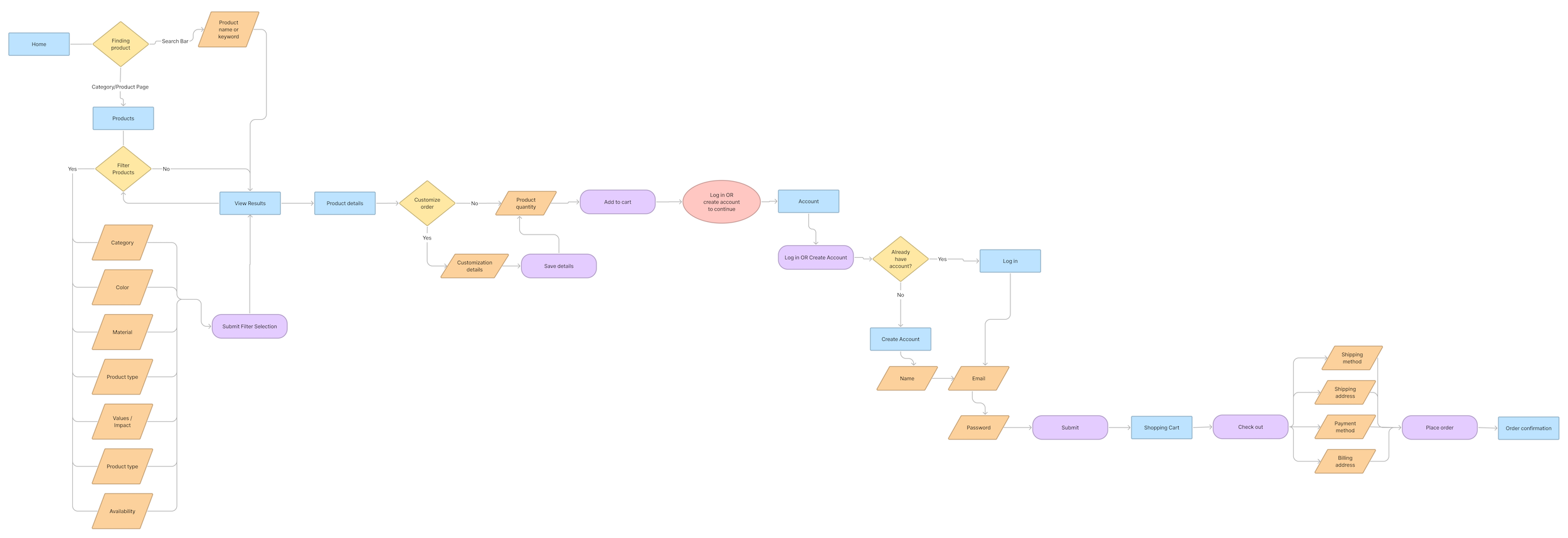
We identified the 3 red routes for this website:
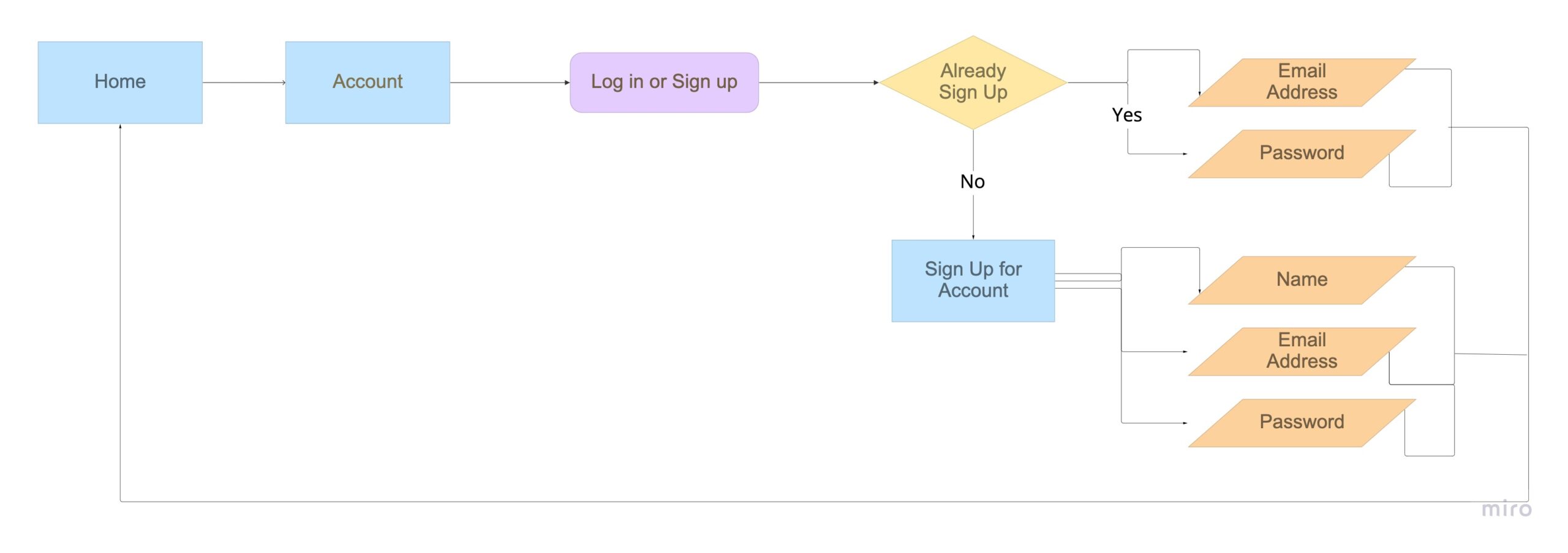
- Onboarding flow: how do people sign up and sign in to the page?
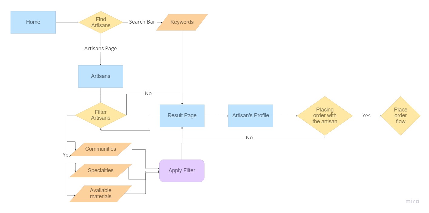
- Search Artisans flow: how do users search and filter the artisans they are looking for?
- Place Order flow: how do user search for products and place the order?
Onboarding Flow
Search Artisans Flow
Onboarding Flow
Wireframe
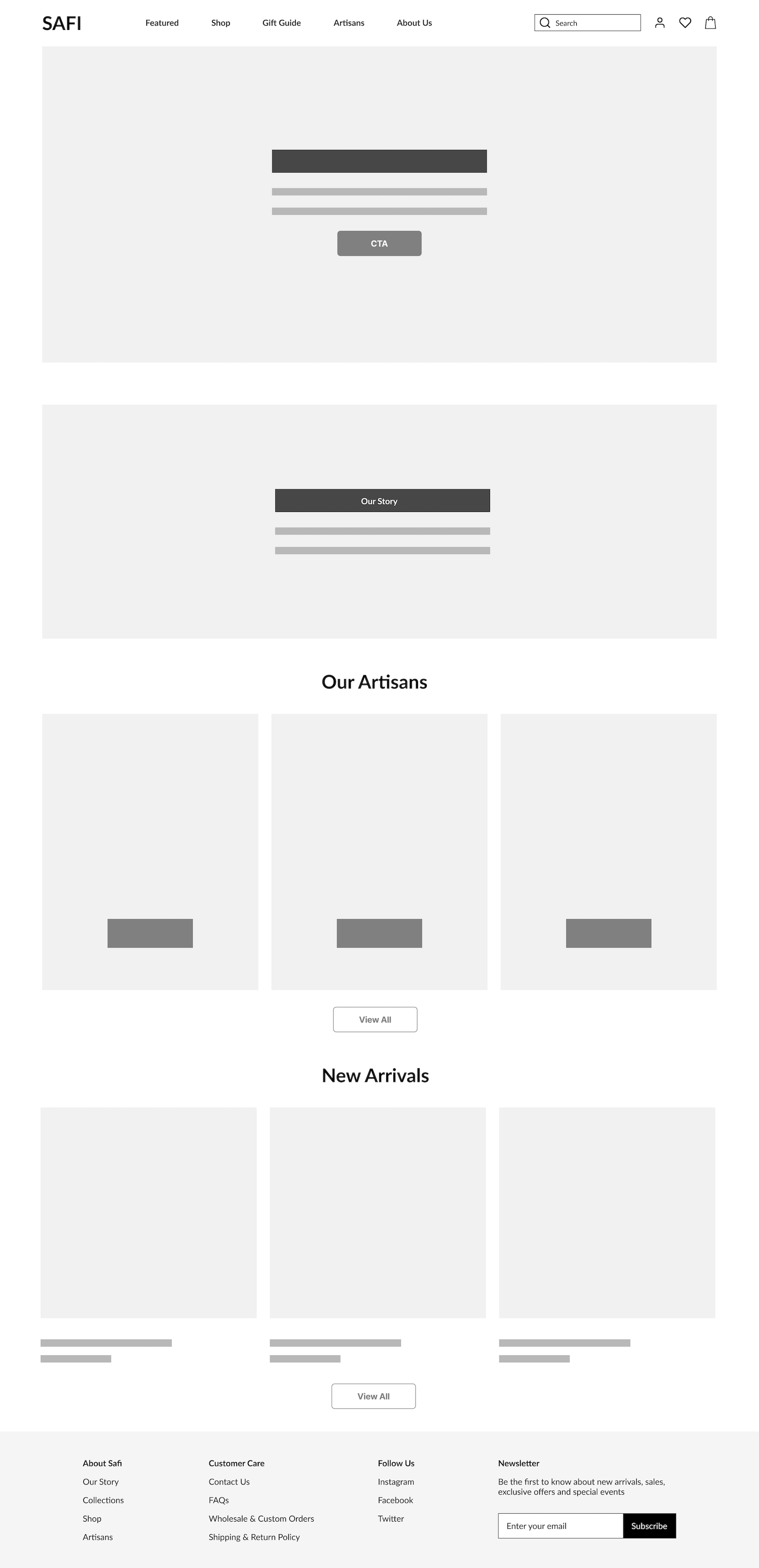
Homepage
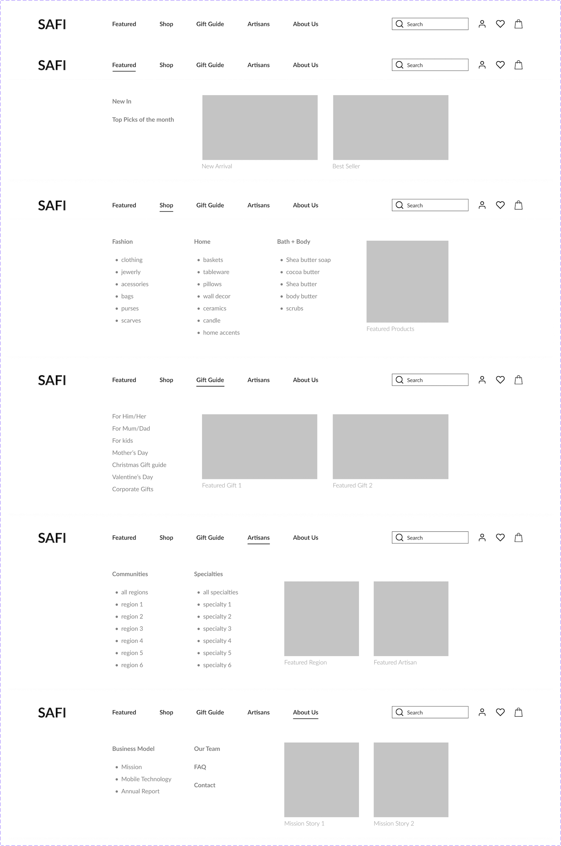
Sitemap
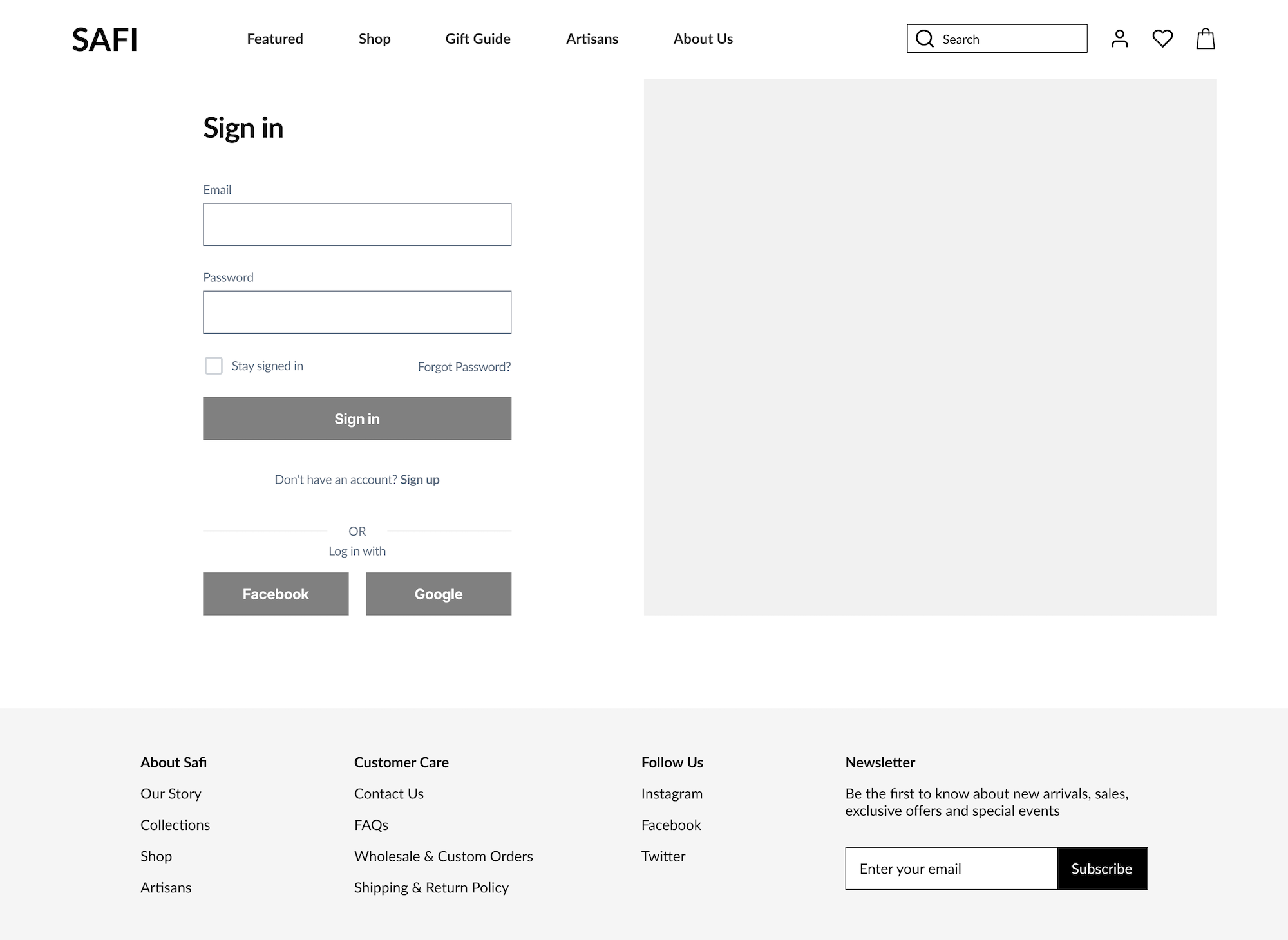
Sign in
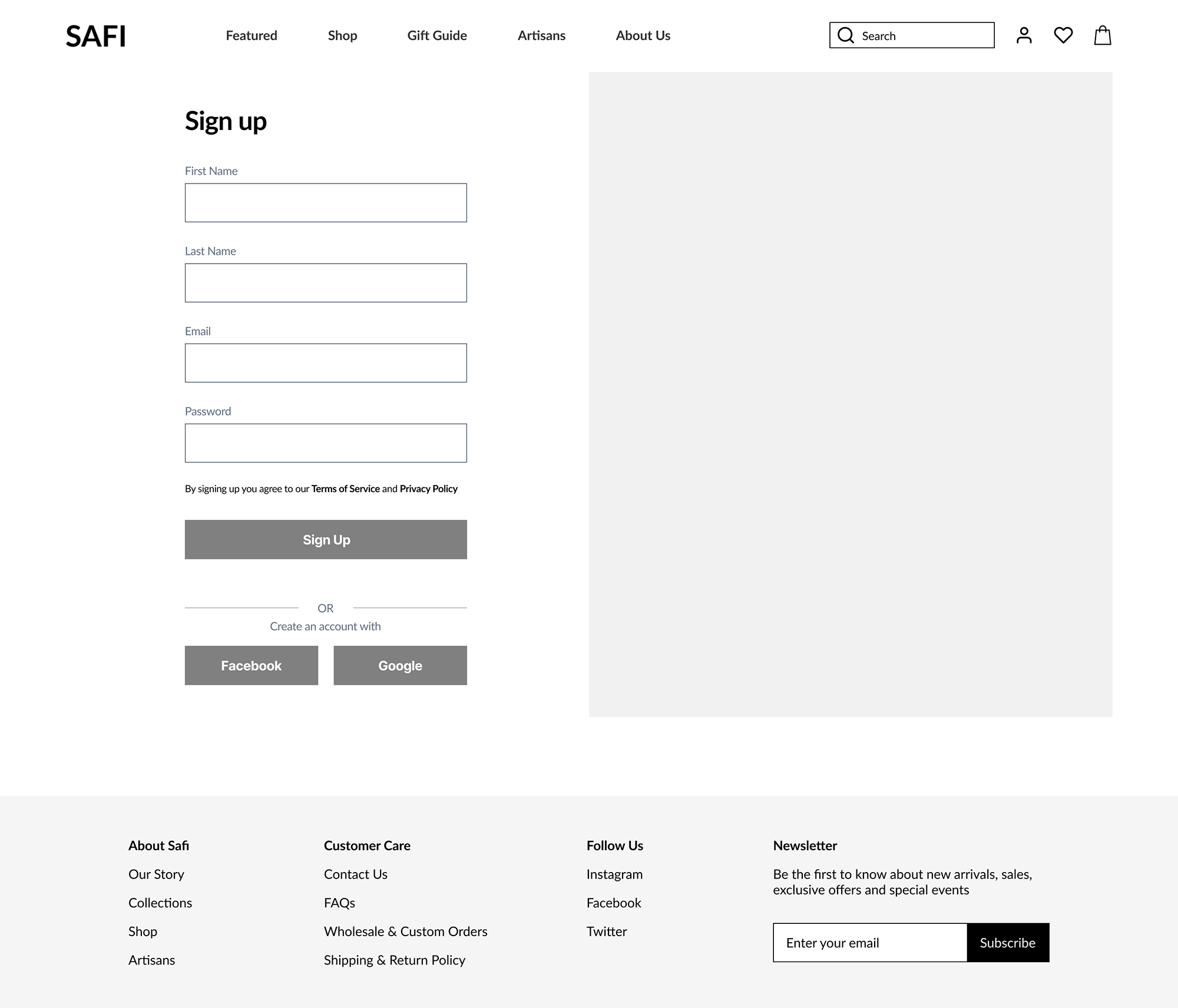
Sign up
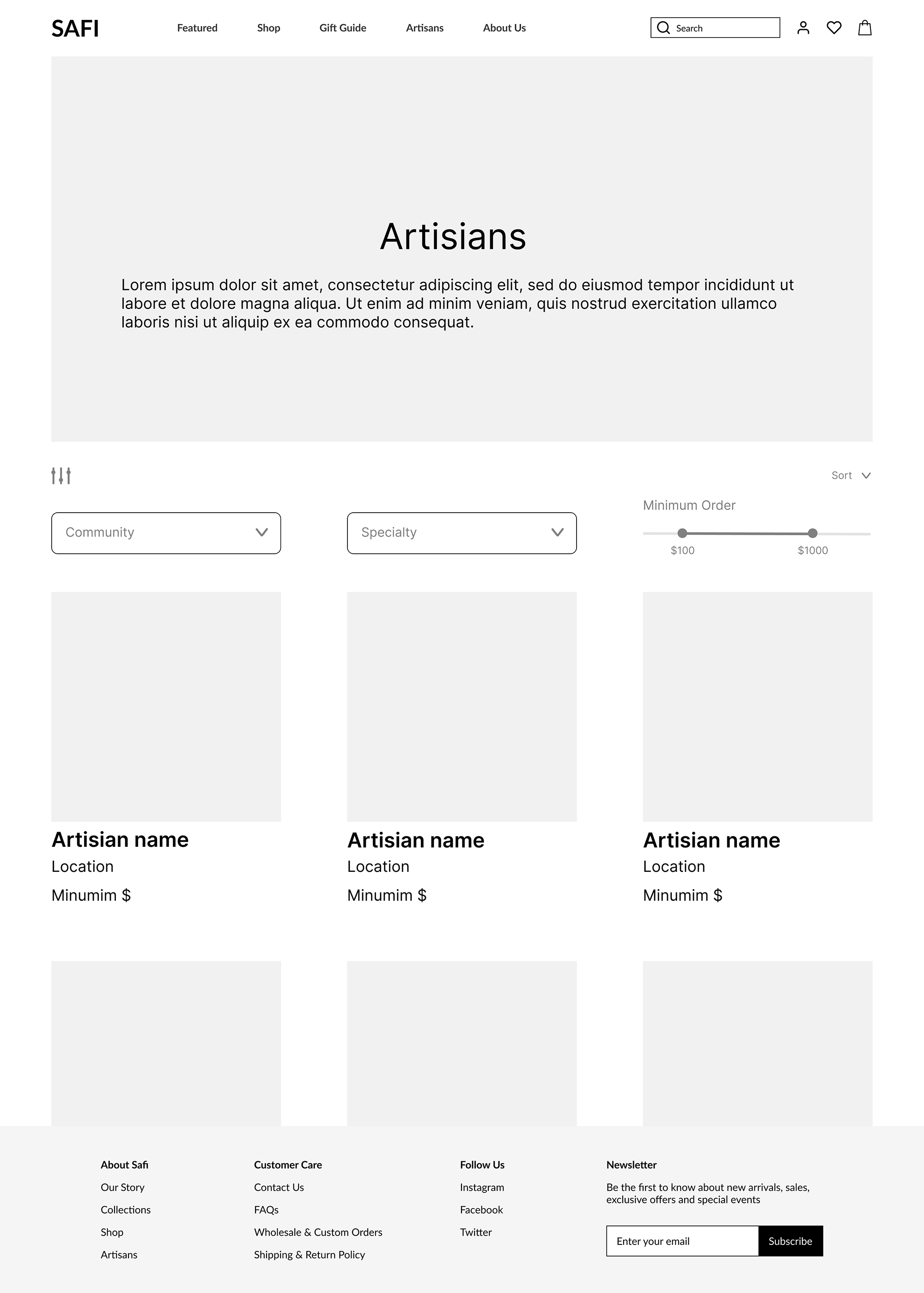
List of Artisans
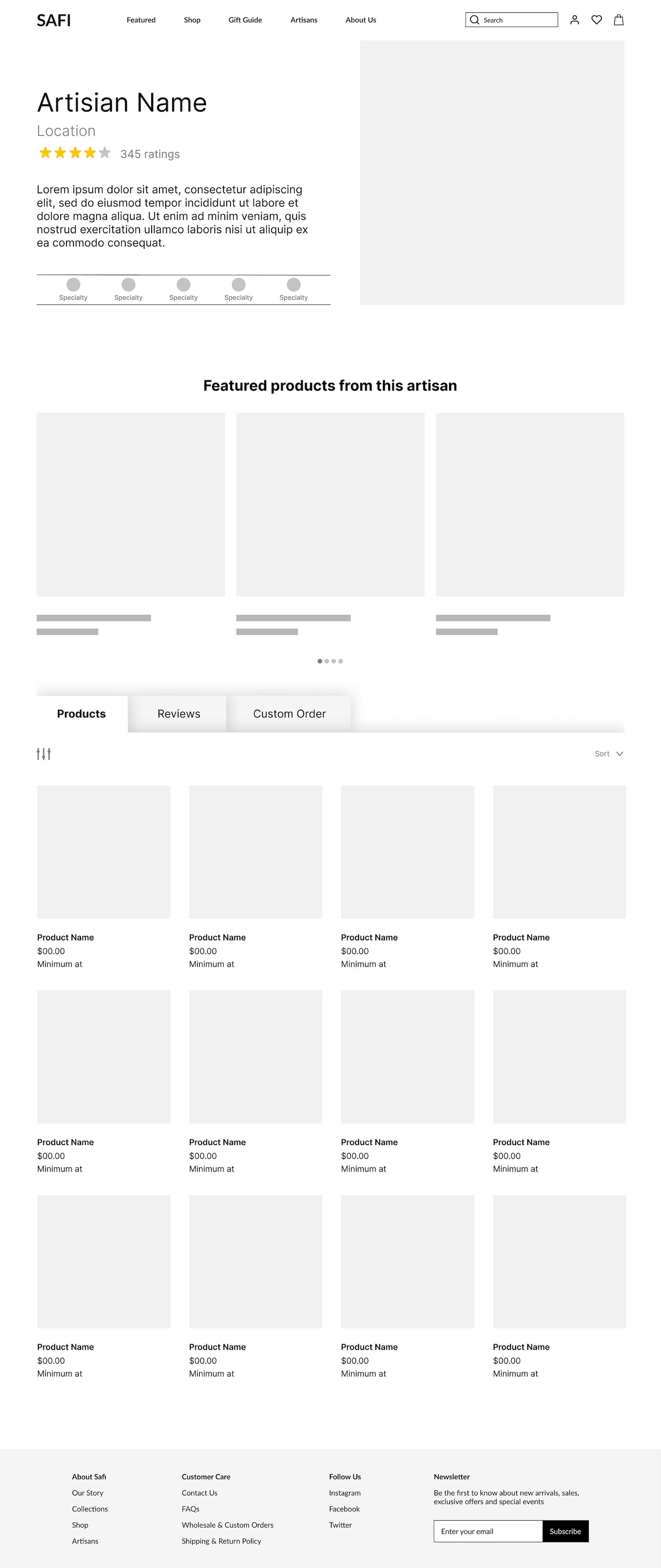
Artisan Detail Page
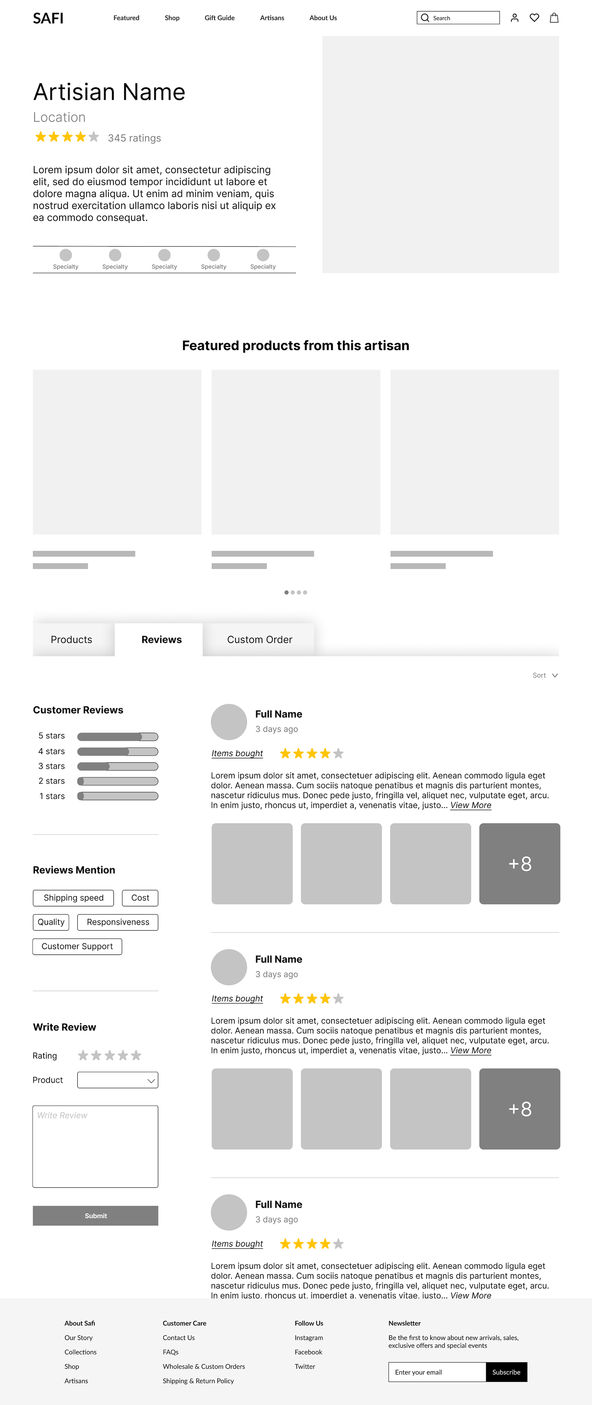
Review Section
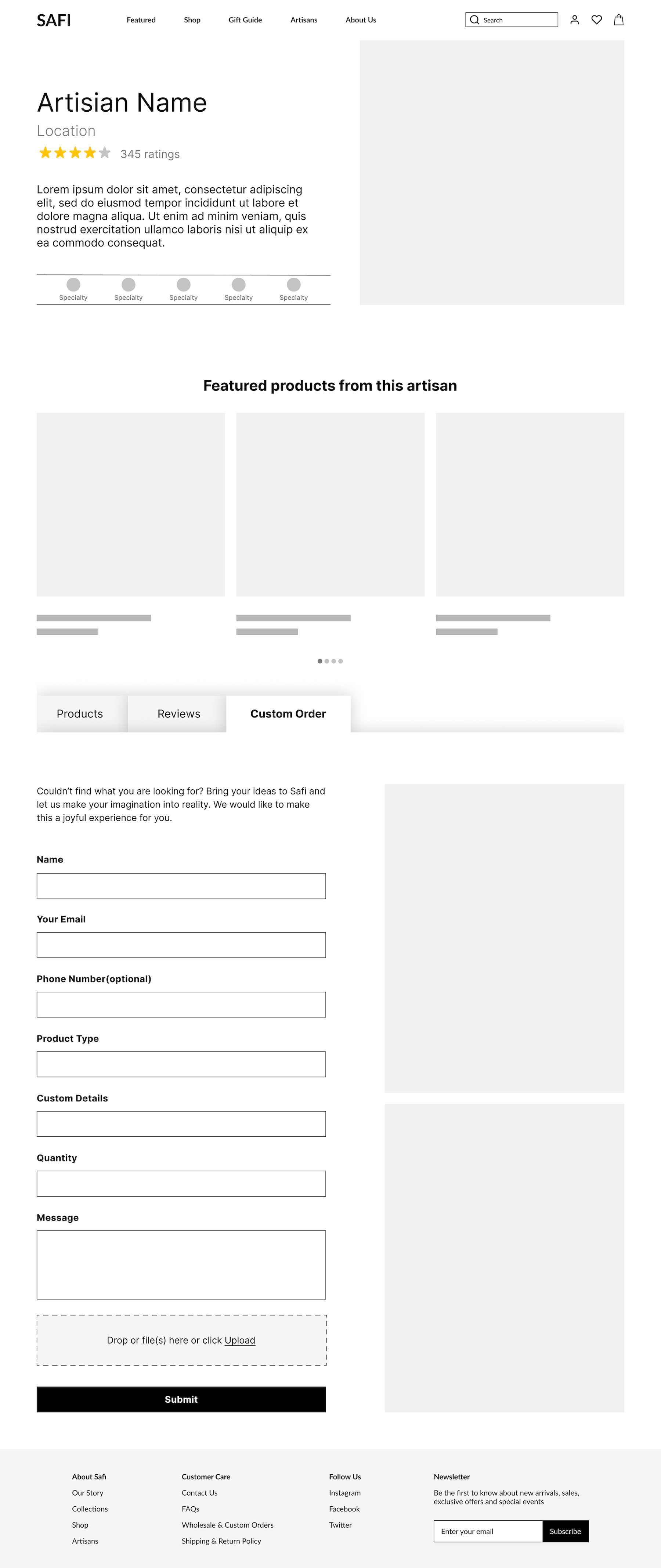
Custom Order Section
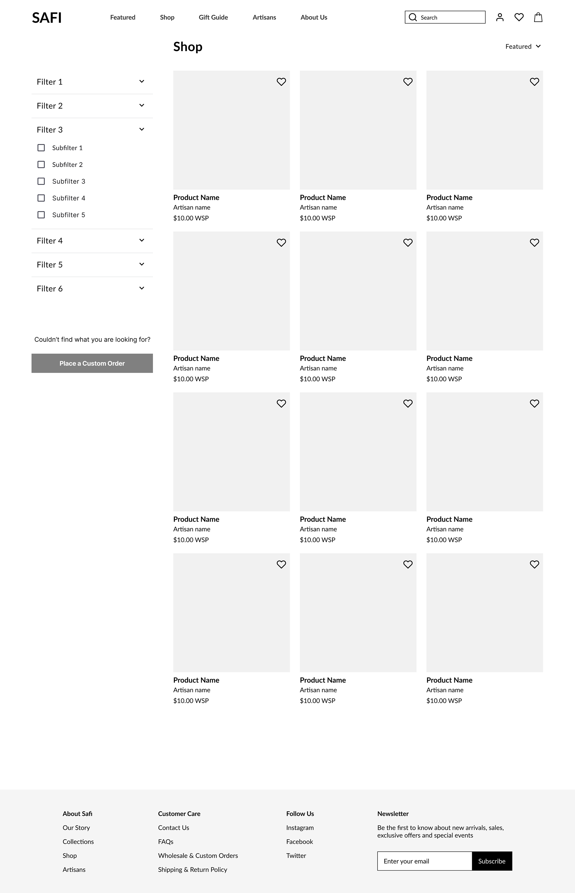
List of Products
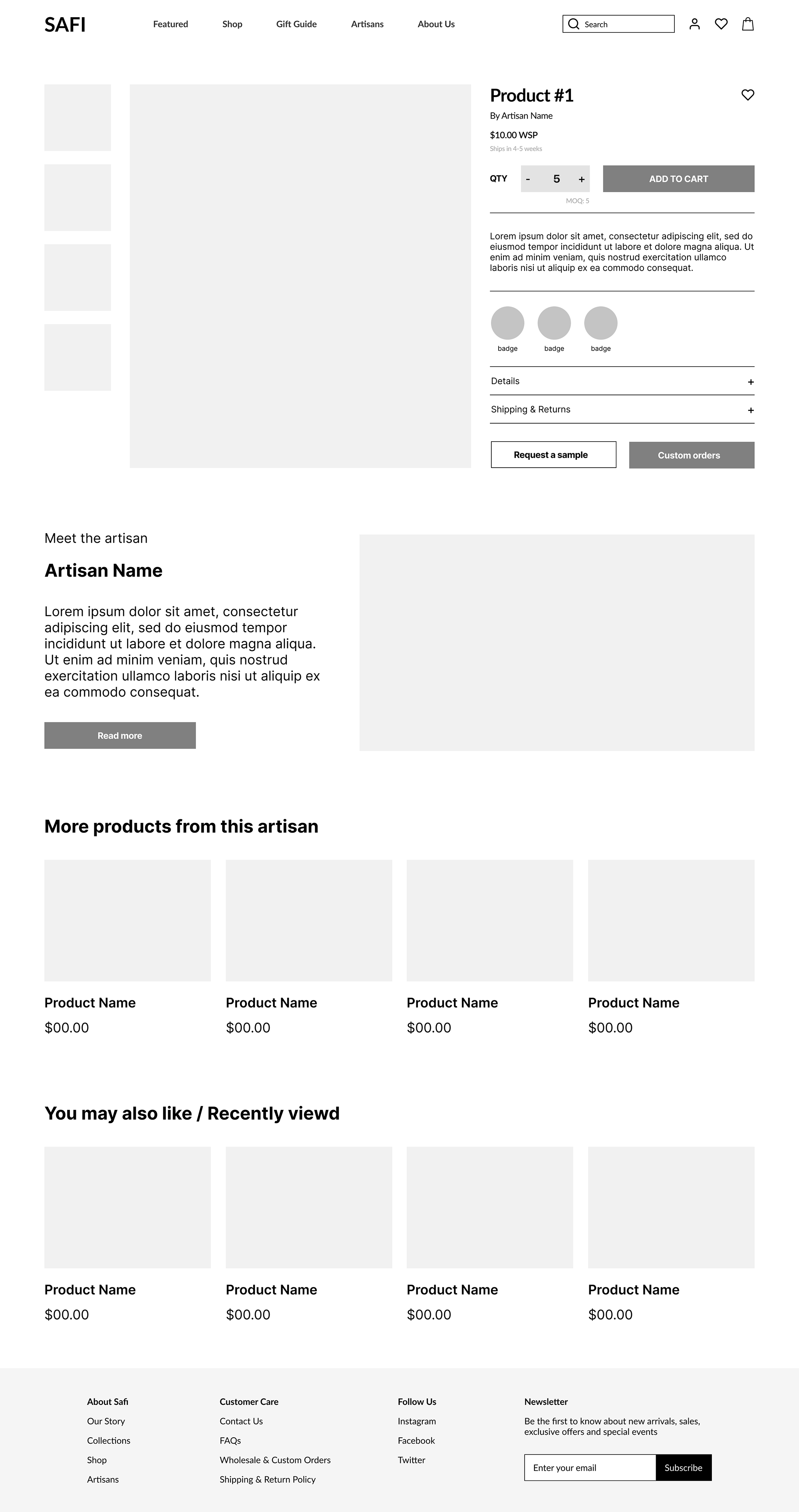
Product Page
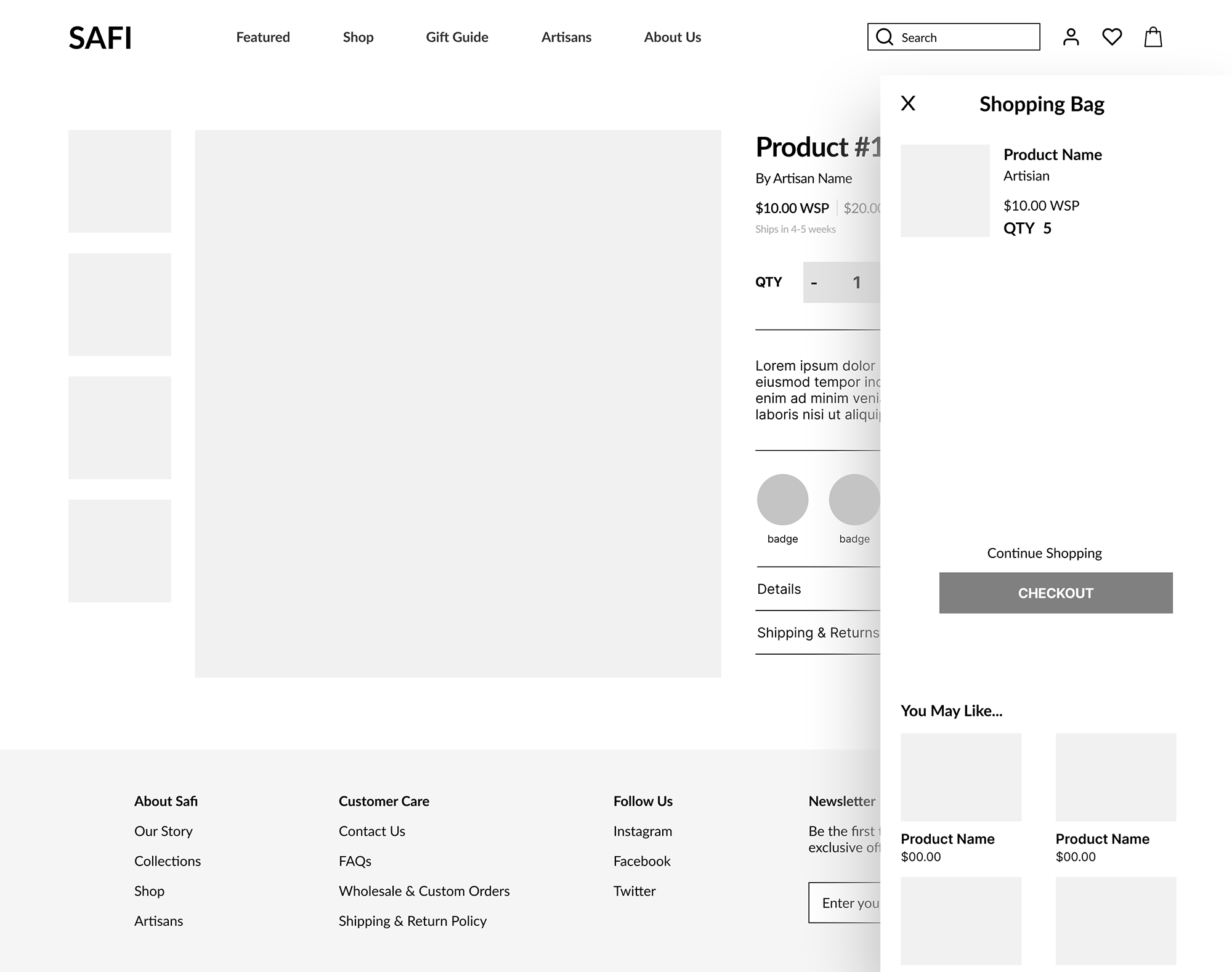
Add to bag
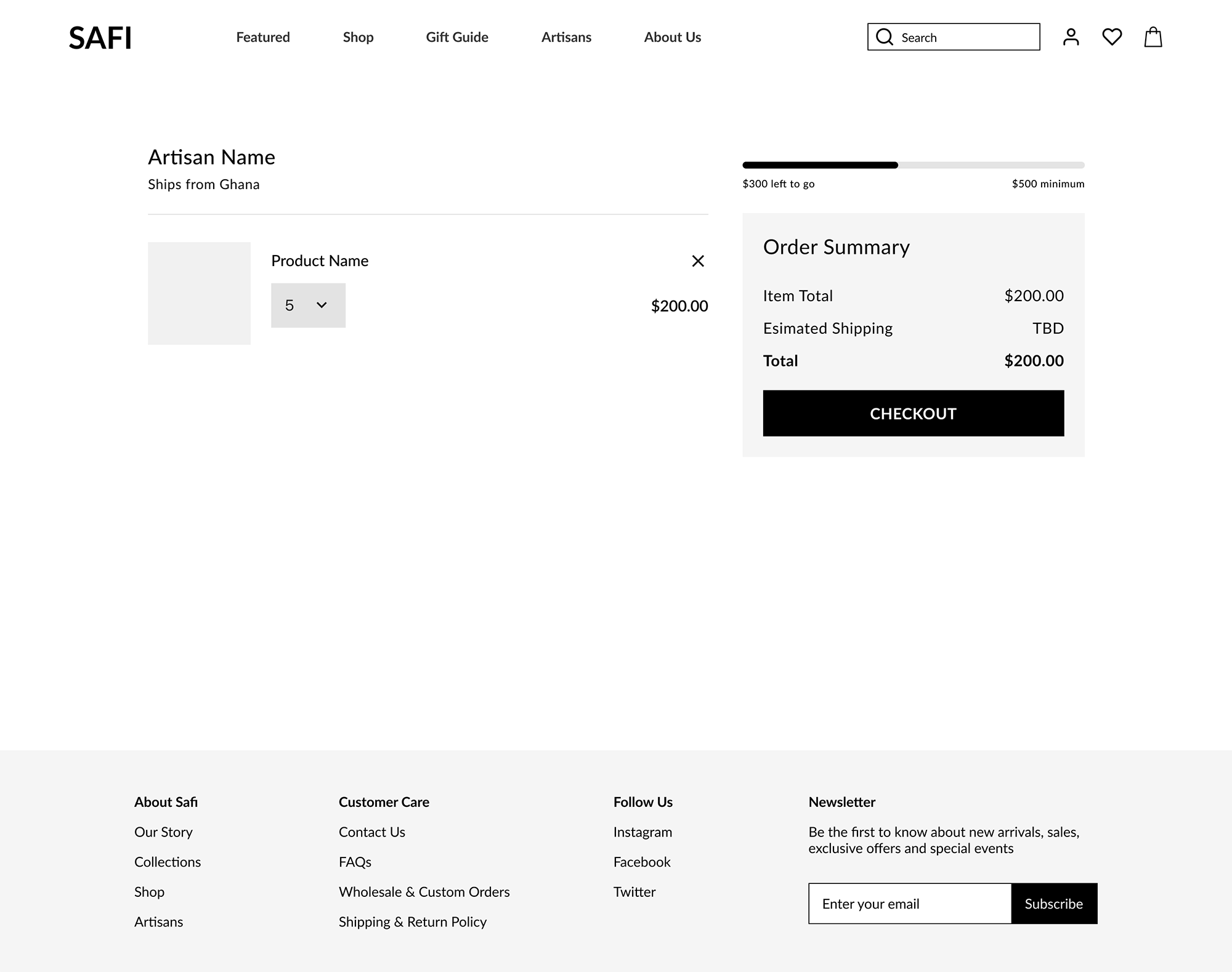
Shopping Cart
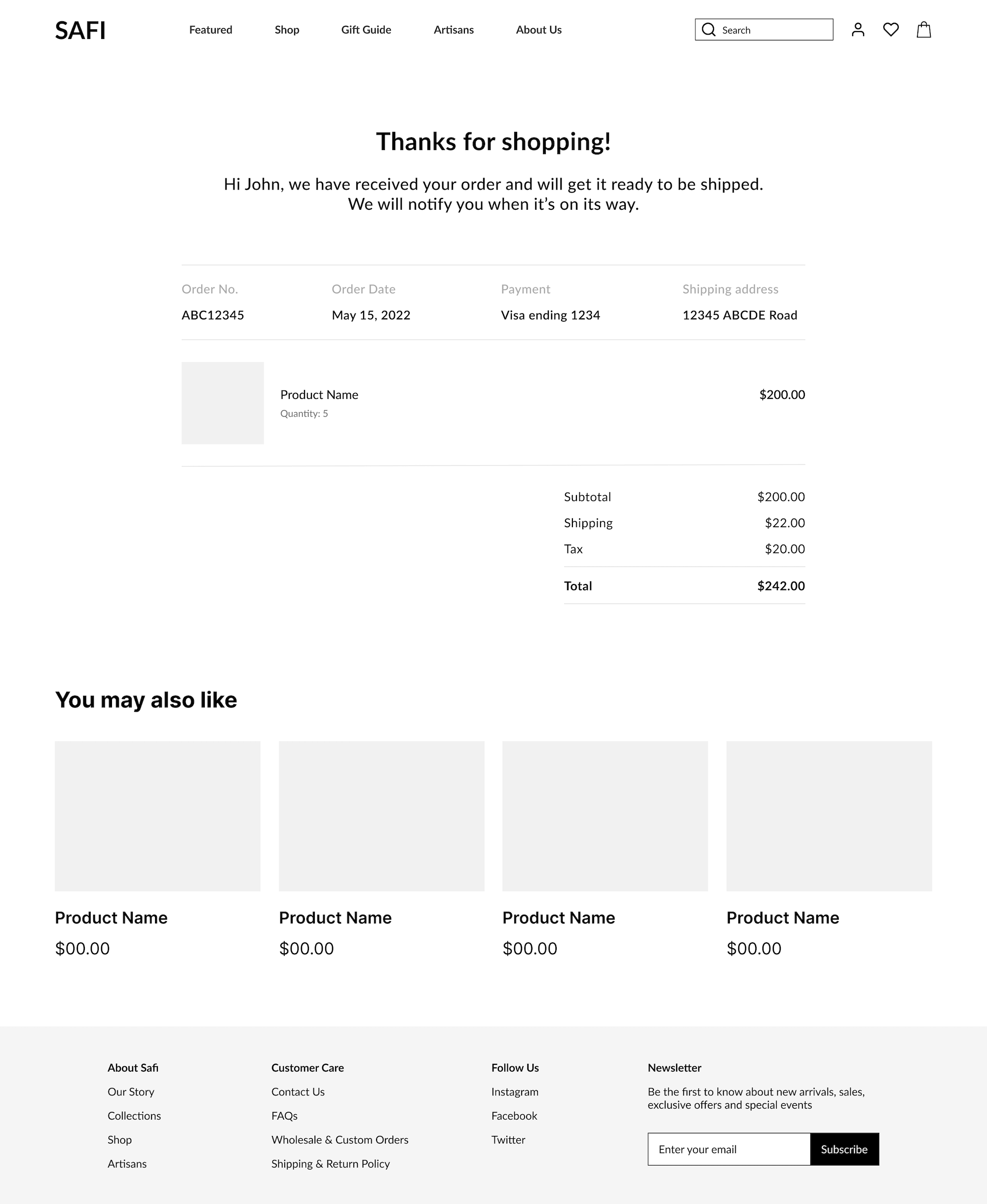
Confirmation Page
Validate
We performed usability testing on 5 users who fit the persona. There were 5 tasks during the testing:
- Sign up for an account
- Search for artisans
- Finding product
- View product details
- Add to bag
Below are key takeaways from our usability testing.
Would like to have breadcrumbs to go back to previous find.
User #1 – Search for products
Able to search for desired artisans.
User #2 – Search for artisans
Able to place custom order from various locations. Would love to have pre-filled options when placing order.
User #3 – Place a custom order
Would like to be able to track orders.
User #4 – Track an order
Would like to have an account view to see history of orders, save account profile, etc…
User #5 – Check out Profile page
Next Step
Updates
After analyzing the usability testing notes, we changed the wireframes and incorporated the style guide to create the Hi-fi prototype. Below are the updates to our key screens:
-
Removing bullets in the listing detail. Update new fonts and logos.
- Apply photos on the homepage and change the content overlay.
- Changed from black text to white text overlay. Updated the filter list and added visuals.
- Updated the filter and custom order CTA
- Apply Google and Facebook button styles.
- Added the artisan’s specific areas of design. This will ease the experience buyers/consumers have when searching for products to purchase wholesale.
- The custom order form with more visuals and verbiage has been updated.
-
Listing the badges of socially and ethically conscious values/artisan missions. This adds a solution to the statement in the brief mentioning Safi’s aim to connect socially and ethically conscious consumers to artisans.
-
Breadcrumbs are added to help go back to the search page.
Remaining Questions
- What are the outstanding accessibility issues that we want to address? For example, will users of the webstie validate that the skills and badges aspect of the website is useful? The people I interviewed liked the feature but did not note a personal need for it.
- How will we create a seamless experience for users to track all of their orders?
- How will we encourage users to engage with the website?
New Feature
I plan to integrate a profile page that provides all needed information to the users such as order history, point system, and message portal to talk to artisans or SAFI customer service.
